

Today, with lives so highly digitalized, it is hard not to depend on digital images in most people’s daily activities. For photographers and designers, digital images are needed to show their work frequently. Therefore, presenting the intent of their work authentically is the most important thing.
Digital photographers and designers share one significant thing in common, which is that they rely on monitors to retouch, do color grading, and create a design or drawing, with results shown on the monitor. How to display work with the correct colors is a key consideration for them, and a monitor’s color temperature is one of the factors that affects accurate color performance.

Figure 1: Color temperature and the color it generates
When it comes to the color rendition of a monitor, there is a common term that many people talk about, which is color temperature. Here is a basic definition of color temperature:
In short, color temperature is how color will appear when it’s measured at a certain temperature using the Kelvin scale. If we have an ideal blackbody that can spontaneously heat up, when it reaches certain temperatures it will start to radiate light in different colors based on the temperature, from red to orange, orange to yellow, yellow to white, and white to blue. And we use the Kelvin scale which starts from absolute zero to measure the temperature (since 0 Kelvin is absolute zero, 273.16 Kelvin equates to 0 degrees Celsius and 32.018 degrees Fahrenheit).
When a monitor is being used in different industries, there are three common standards. In the world of photography and design, 6500K (D65) is often used as standard white while in print it’s usually 5000K (D50). In video and cinematography, it’s usually 6300K (D63).


Figure 2: A comparison between images with cool tone and warm tone
Because color temperature is related to the color rendition of a monitor, it will dramatically affect how color is perceived. If the color temperature is higher, images on the monitor will appear bluish. On the other hand, it will give hints of red, yellow, or other colors in warmer tones when the color temperature is lower.
Sometimes, various color tones trigger certain kinds of feelings. For example, with higher color temperature, an image with a cool tone usually creates a sad and tranquil atmosphere while with lower color temperature, a warm-toned image usually instills an optimistic and lovely feeling. Therefore, it is important to choose the right color temperature for the monitor so it can deliver the emotional impact that the work was intended to create.
Another thing to consider is the fact that ambient light will affect how we perceive the picture we see on a monitor. When ambient light has a color temperature higher than the monitor, we feel the picture shown on the monitor is more yellow than it really is. When the color temperature from light sources in the environment is lower than the monitor's, we perceive the image on the screen as being bluer. Ideally, the color temperature of ambient light in the environment should be the same as the monitor, so we can perceive the colors of the image on display correctly.

In the working environment of certain professions, like photography and design, the color temperature of the monitor must be predictable and accurate, so work can be done properly and meet professional requirements.
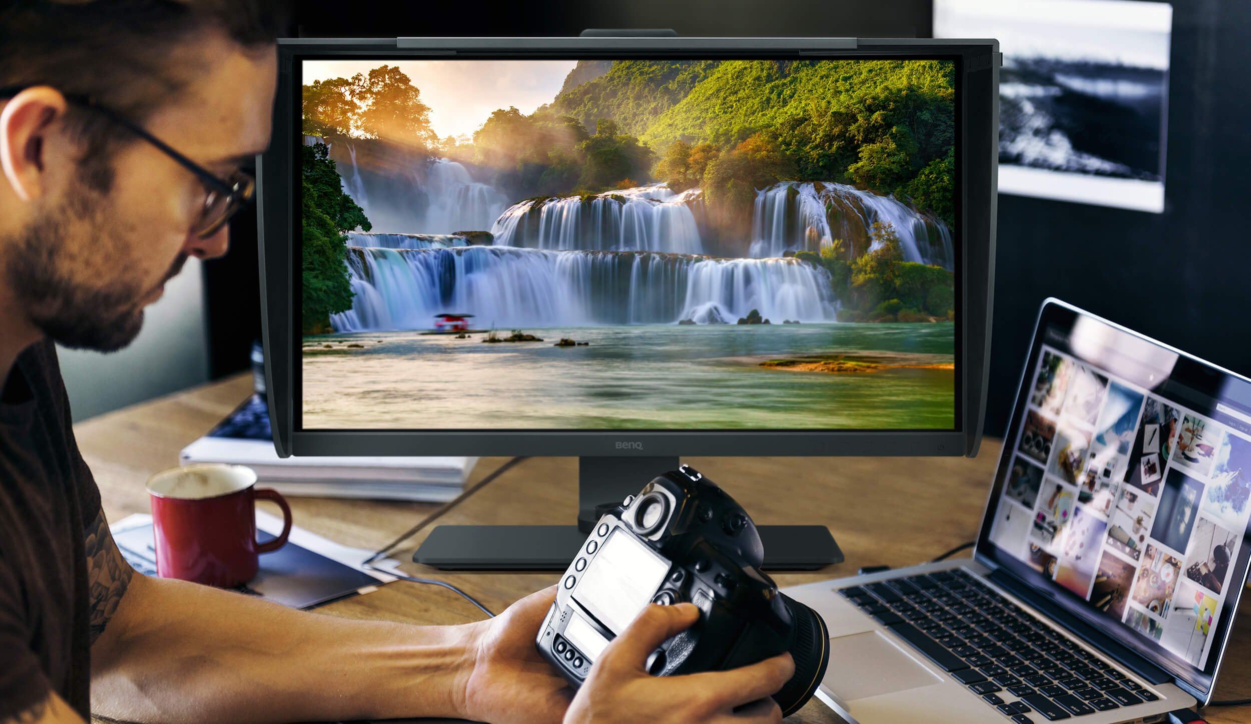
Take a commercial photographer as an example. When it comes to the color of the photos she spent time and energy to capture, even after being reviewed by human eyes, they still have to be shown with correct color on the monitor so they will present the original intent of the photographer. The correct color temperature on the monitor must be an accurately-controlled element. It is also a very important part of the quality control process because if there is color temperature inaccuracy that causes misjudgment, that will affect the photographer’s competitiveness and professionalism.
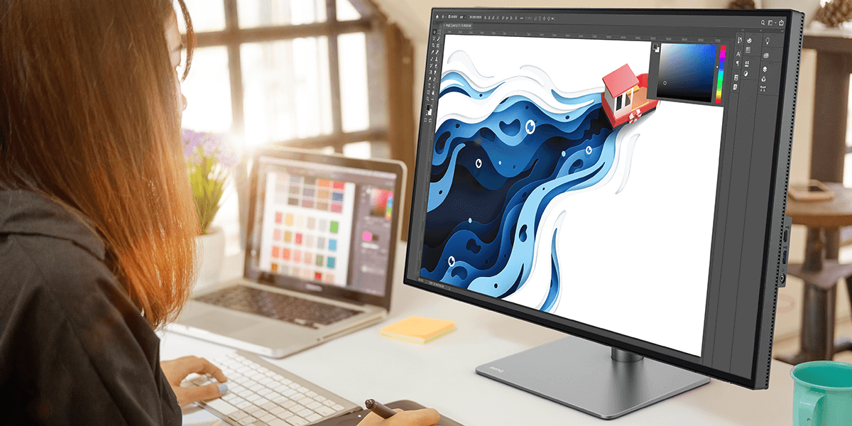
Similarly, a designer will rely on a monitor to make adjustments and comparisons between images most of the time during the designing process. Designers need monitors to review the images they are working on as well. Therefore, they will count on the color temperature of the screen and it has to accurately show the correct color temperature.

When users need to work with multiple monitors, there are a few things to keep in mind. In a working environment with multiple monitors, it’s very common to pass work between different monitors that may not be consistent in color rendition. This discrepancy causes the problem of viewing an image with inconsistent color on different monitors, which is troublesome. Therefore, we can’t neglect the importance of color consistency across different monitors.
What is color consistency? In short, it means that the same picture can be shown with the same or very close colors or color temperature on different monitors. If we put a picture on different monitors that each have their own color rendition, that will create work flow difficulties and affect the quality of the design. Color temperature is a key element that will decide if visual work is presented faithfully.
Therefore, it’s important to have color consistency across different monitors. It’s related to whether or not the monitors can show brilliant colors accurately. Normally, when a model of monitor is designed and shipped to market, the manufacturer will set up the color temperature correctly, meeting the industrial standards to avoid unnecessary misjudgment on the user's end.

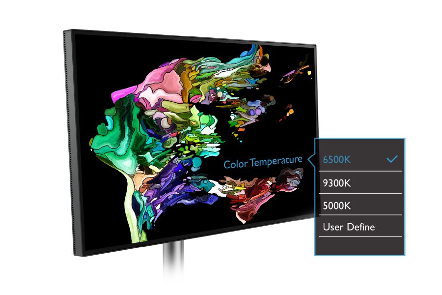
Figure 3: Select Preferred Color Temperature on Monitor OSD

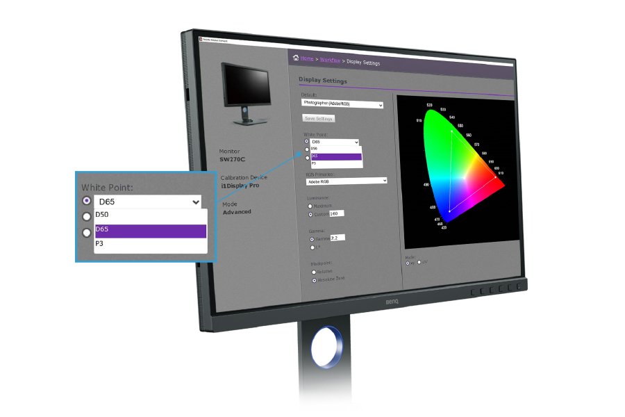
Figure 4: Select Preferred Color Temperature with
BenQ Palette Master Element Software
If users need to adjust the monitor for their own specific needs, they can adjust the color temperature of the display via software interface (e.g. BenQ Palette Master Element), as well as adjust the display’s color temperature or select a preset color temperature from the monitor’s OSD.

A monitor with accurate color temperature is critical to maintaining consistency across source materials and carrying out creative work. If said creative work is communicated using inaccurate color temperature, the process will prove ineffective. Therefore, accurate color temperature that meets industry standards is essential to perform creative work accurately and to communicate effectively and efficiently.