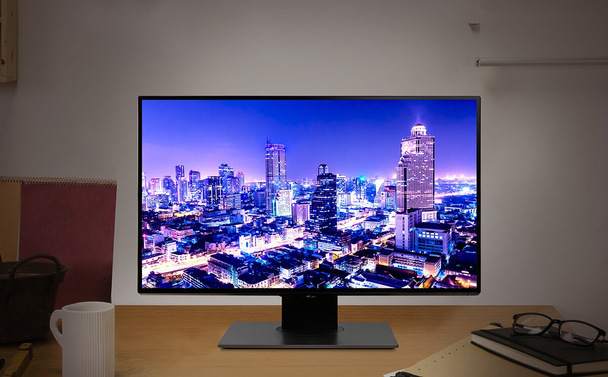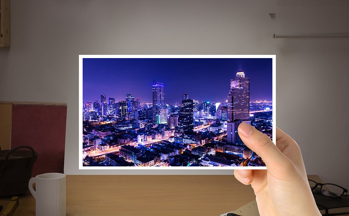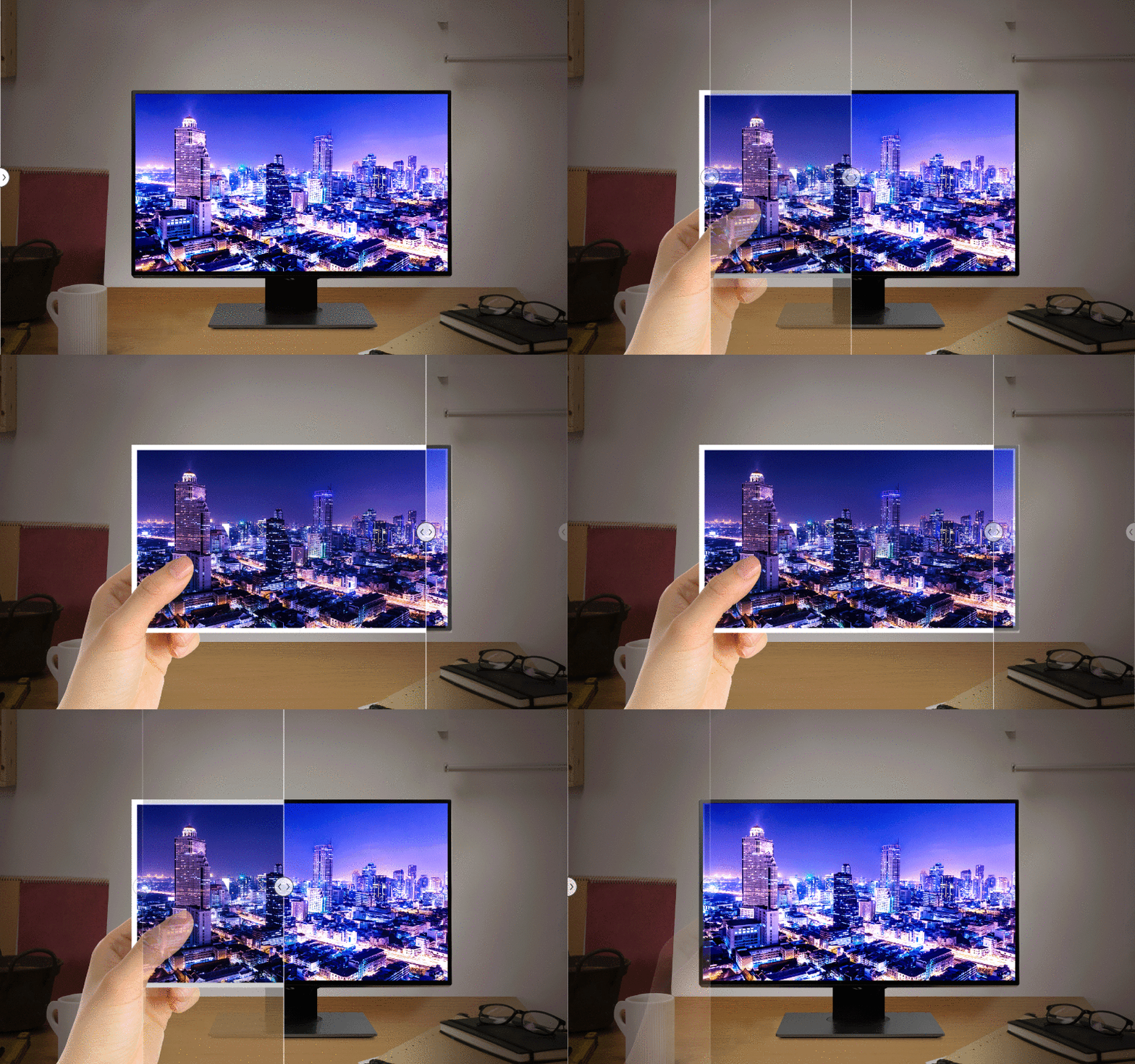


Photographers tend to have a preferred setting for the brightness level on their monitors. They usually decide this level based on the need to work comfortably for long hours editing pictures and the preference to work in dark environments. However, brightness can have an impact on the accuracy of your results.
Have you ever found that your printed photos do not look the same as on the screen even with a calibrated monitor? That is because brightness affects how colors appear on your screen and calibrating your monitor for accuracy is only half the task.
Brightness is increasingly a critical spec for monitors. In the realm of video content, brightness is in part responsible for achieving HDR quality. When dealing with photography, brightness makes colors on the screen look more vivid. Therefore, many monitor manufacturers focus on increasing the nit rating of monitors as much as possible to present their products as more technologically advanced.
Besides color space specifications and calibration, adjusting brightness is another step you need to take to obtain the most accurate results..

If your prints don't look the same as the picture on your calibrated monitor, consider adjusting the brightness.
Within the Adobe RGB (1998) Color Image Encoding white paper is a section dedicated to “reference viewing conditions”. What this means is that besides having a reference monitor, viewing conditions need to be controlled to obtain optimal results.
Using a color-accurate monitor is only half of the equation to get accurate prints. The second part is making sure viewing conditions match those of the original specifications of the Adobe RGB standard. Amongst other factors, setting your monitor’s brightness to the right level ensures that colors in your prints look just like they did on your screen.
All of our AQCOLOR SW series monitors already have a default brightness of 150 nits out of the box, meaning you don’t need to make any adjustments on your side. Regardless of the maximum brightness of the AQCOLOR monitor you choose, you can rest assured colors will look right when working with default brightness as-is.