

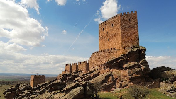
To paraphrase the catchphrase of HBO’s most successful series, “Season 8 is Coming.”
The final season of Game of Thrones debuts April 14, 2019, and by all accounts will be the most groundbreaking and earthshattering events in television history. Already ahead is the “Battle of Winterfell,” which promises to be the longest and most intense battle scenes ever filmed. Critics predict the battle will eclipse even the 40-minute long siege of Helm’s Deep in the Lord of the Rings film series. The battle will pit our human heroes against the Army of the Dead led by the Night King.
One of the reasons Game of Thrones is a groundbreaking television series is because it’s not like a television series at all. Every episode is cinematic and produced like a motion picture. Some reports have the per-episode price tag at $15 million. The ensemble cast has won many awards internationally, but the real stars behind the series are the special effects and production design teams that brought George R.R. Martin’s A Song of Ice and Fire to life.
It’s all about color, or the color palette, to be precise. Colors create moods and define locations and are actually characters themselves. For instance, there’s the southern Westerosi coastal city of King’s Landing, bathed in sunshine and presented in warm tones of yellows and reds. In contrast, there’s the northern stronghold of Winterfell, in a frigid and dark land rendered in deep blues and blacks, almost devoid of color.

King's Landing (HBO)
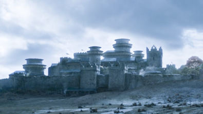
Winterfell (HBO)
Then there’s the overall color palette for the series as a whole. In a land where seasons can last decades or even generations, devotees of the novels and the series know “winter is coming.” This seasonal change has progressed over the first seven seasons, and the palette of the show has steadily progressed to a colder, darker, more ominous look and feel. Game of Throne’s color palette has shifted from summer to winter, and the onset of winter has desaturated the colors of the series. Season 1 Episode 1, “Winter is Coming,” used the lightest color palette, and the penultimate season, Season 7, was the “coldest” so far.
The darkest episodes were the ones that centered around grand night battles. In Season 2, Episode 9, “Blackwater,” the only real splash of color was the neon green of the “wildfire” used to incinerate an attacking armada. The entire episode is dedicated to the climactic Battle of the Blackwater, in which the Lannister army, commanded by acting Hand of the King Tyrion Lannister, defends the city of King's Landing as King Stannis Baratheon's fleet stages an attack at Blackwater Bay.
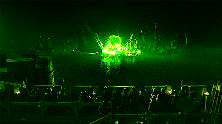
The Battle of Blackwater Bay (HBO)
Another epic Game of Thrones night battle came in Season 4 Episode 9, “Watchers on the Wall.” The episode focuses exclusively on the Wildling assault on Castle Black and the Wall, and the Night's Watch defense, led by Ser Alliser Thorne and Jon Snow.
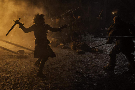
Defending Castle Black in "The Watchers on the Wall" (HBO)
The primary colors in the Game of Thrones palette are red, black, gray, yellow, green, gold and red. These colors represent the personalities and the legacies of the groups battling for the Iron Throne.
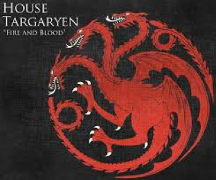
Both colors evoke strength. Red represents passion while black is a color that is dramatic and “protective.” The best exemplar of these colors is the Mother of Dragons herself, Daenerys Targaryen.

Gray is a combination of black and white, and the colors represent the main traits of the Stark clan, strength and purity.
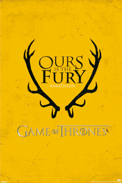
Yellow is a vivid color and is used to convey the Baratheon’s intelligence, education and business sense. They are master strategists, and Stannis Baratheon was known as a great military leader (until he wasn’t).
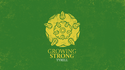
Green signifies growth and prosperity while yellow denotes cunning and intelligence. The best-known example of these qualities is the late Margaery Tyrell, whose beauty and presence hid a desire to become Queen of the Iron Throne at all costs (until that big explosion at the Great Sept of Baelor).

The family that brought us the uncomfortable closeness between siblings Jamie and Cersei are represented by gold, displaying success and courage, while red paints the personality traits of anger, power and passion. They thirst for fortune while they will do anything to hold on to power. Jamie, unlike his ruthless sister, Queen Cersei, is the only one with a glimmer of conscience. He slayed the Mad King, after all.
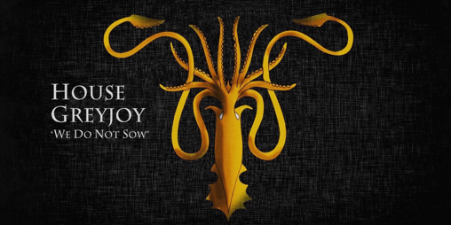
Take, take, take is all the Greyjoys want to do. Like their sigil says, “We do not sow.” All they want to do is reap. For them, black denotes death and gold represents their greed. In other words, they will not hesitate to kill for the gold.

For House Tully, blue and red make an interesting mix. Blue stands for loyalty, but on the other side signifies coldness. Red encloses strength, passion, anger and desire. It’s a battle of opposing forces and that’s what brought them down. Catelyn Tully, wife of Eddard Stark, exemplified love, passion, loyalty and strength. Her sister Lysa, on the other hand, had a jealous propensity to push rivals through the Moon Door, sending them plummeting to their deaths.
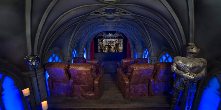
As we’ve seen, color helps tell the Game of Thrones story. But how does BenQ reproduce them as the show runners and production designers and directors and cinematographers and editors intended?
To answer that question it is first important to know what color is and how it’s reproduced in a digital image. One of the ways to convey color digitally is by breaking it into its three properties: hue, saturation and lightness, known as HSL color space.
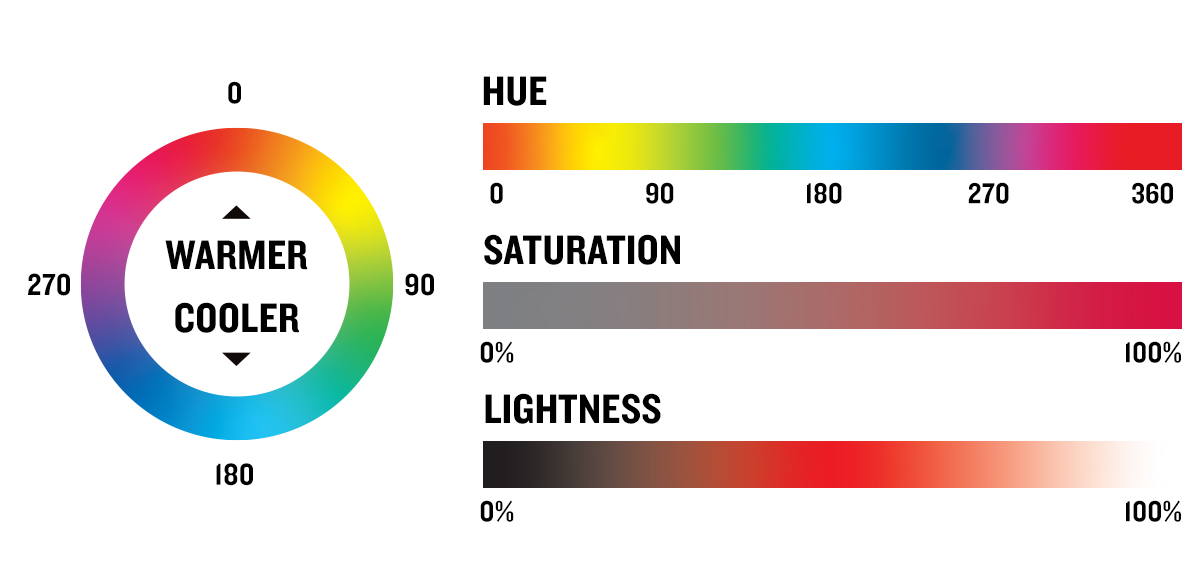
The names we give colors really refer to their hue. Red, orange, yellow, green, blue, indigo and violet make up the rainbow and are hues. Hue is measured in degrees, starting with red at 0 degrees, transitioning to cyan at 180 degrees, and then coming back full circle to red at 360 degrees. Colors in the top half of the circle are considered warm colors, and those in the bottom half are cool colors.
Next comes saturation. That is a measure of the purity of the color, by measuring how much gray is mixed in. Saturation of 0 percent is entirely gray, while 100 percent is the purest version of the color.
Lightness is the amount of white in the color. When lightness is at 0 percent the color is black, and when lightness is at 100 percent the color is white.
Our eyes are not very good at seeing hue, saturation and lightness as three separate elements. For example, it’s easier to choose which shade of red is the lightest than to pick the lightest of two different colors.
Of all DLP projector components, the color wheel has the greatest effect on color. Achieving perfect balance between color accuracy and brightness requires high precision and stringent quality control. Because even nanometer differences create great differences to color spectrum, BenQ CinematicColor™ uses precise nanometer-level references to test over 20 combinations of color wheel angle and coating. Each color wheel is carefully fabricated with high-pure-color coatings to meet Rec. 709 color gamut requirements and reproduce the true color of Hollywood films.
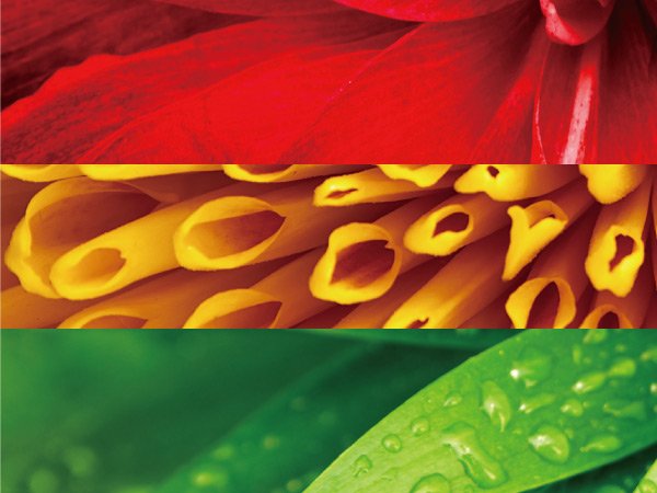
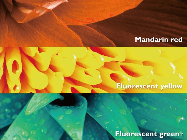
With a BenQ projector like the CinePro Series, CinePrime Series and the , you can ensure viewing content as rich as Game of Thrones will present A Song of Ice and Fire in all its multihued glory. With dragons.
{{title}}
We will notify you when we have more.
We will send you an email once the product become available.Your email will not be shared with anyone else.
Sorry, our store is currently down for maintenance.We should be back shortly. Thank you for your patience!